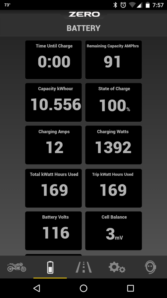
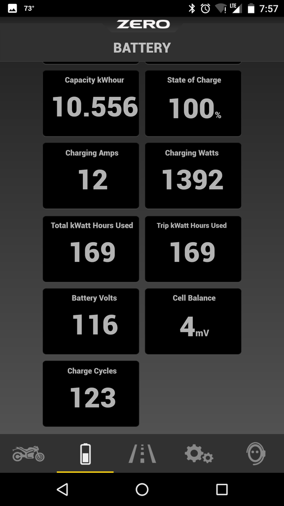
It looks like a slight face lift for the app too....at least on the Android side of the house. Mainly, I notice some yellow highlighting at the bottom for the screen selected and a change to the battery page so that you don't have to toggle tabs in order to see all the battery info....now you can just scroll and for my Nexus 6P that means I can see everything about the battery on one screen except for the number of charge cycles which I don't really pay attention to.
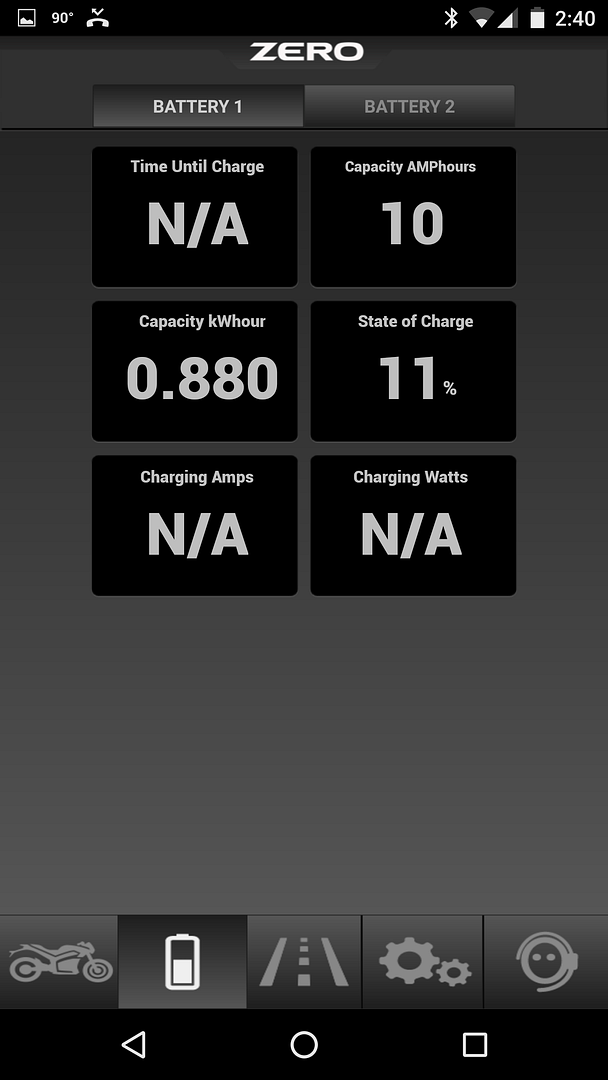
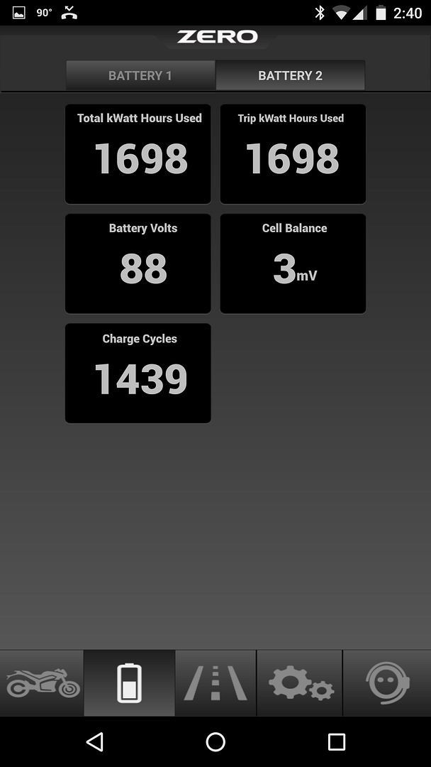
Here is a before picture of the battery screen. Every Android user should be familiar with the Battery 1 and Battery 2 tabs.
Here is the OLD Battery 1 tab

And the OLD Battery 2 tab

And the NEW Battery screen


And if you scroll down on the new battery screen you see the charge cycles.

I also noticed that the app seemed to connect to my bike a lot quicker than normal. Usually I have to turn the bike on and hold the mode button and then connect. But with the updated app....I had it opened when I walked out to my bike and it just connected automatically! The information was wrong but as soon as I turned the bike on everything looked perfect! I bet the bad data before turning the bike on is because I have a 2014 Zero S. Newer bikes may see better performance.
Other than that it doesn't look like any other changes. The riding screen looks the same and they haven't added any new options to put on the riding screen (like battery voltage or cell balance).